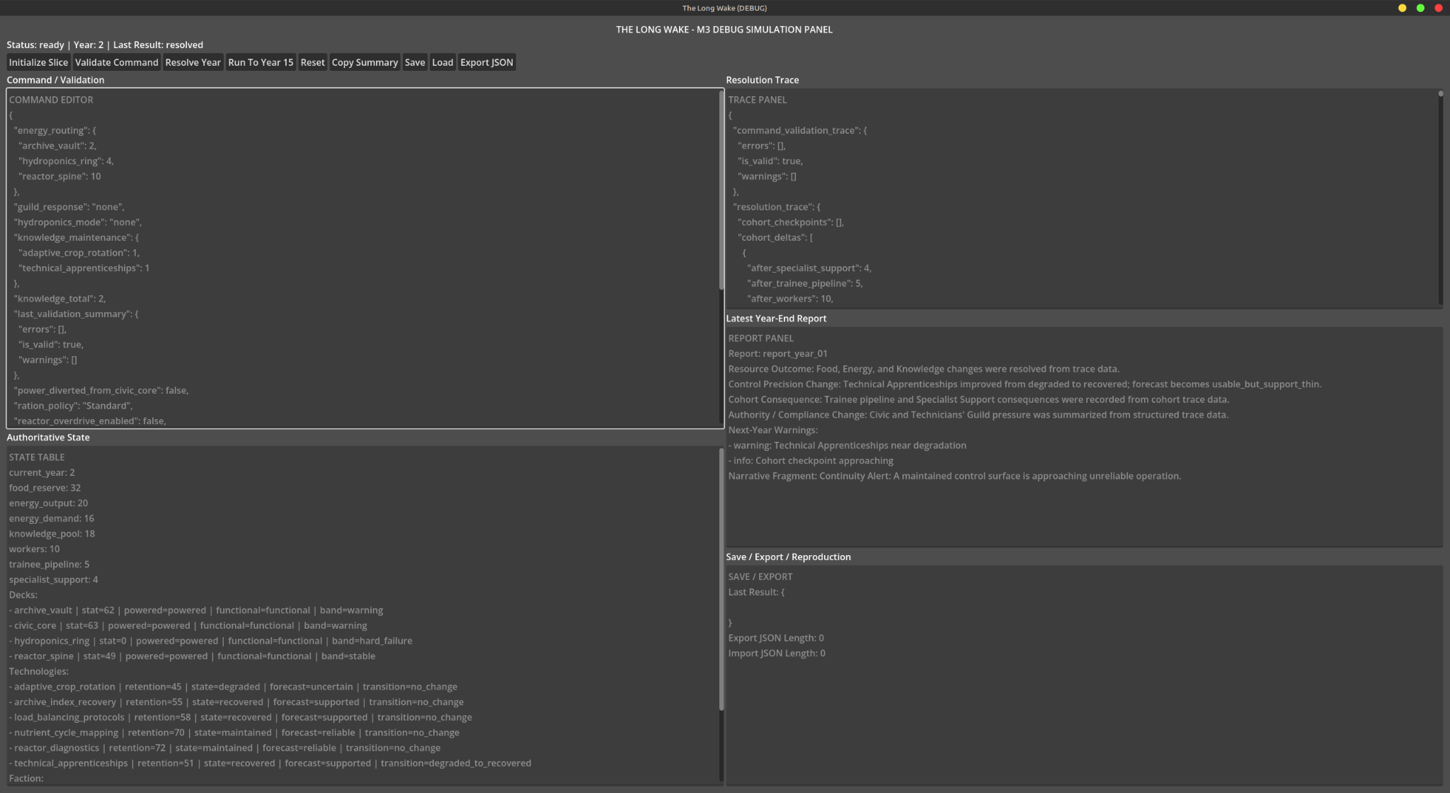
I had working pieces of The Long Wake before I had an interface I wanted to live in. The Godot reports showed specific retention and save/load tests passing: knowledge could degrade, training could bring a capability back, and the resolution trace could explain why. Then I looked at the M4 command interface and rejected it. Forecasts ran together, the decision brief did not say what needed attention, and the Continuity display asked me to read too much at once. The simulation had become more precise than the place where a player was supposed to understand it.
That sent the project through several presentations of the same underlying question. I wanted the player to keep a generation ship alive by managing people, resources, decks, and fragile knowledge. I tried an aged-glass command-panel direction and then a Svelte/Vite web interface. The web attempt produced useful interactions but repeated layout problems. I eventually told the assistant to abandon it and return to a Godot Control desktop workstation. The story of this stretch of work is not a straight march toward a finished screen; it is the attempt to find one that made the decisions legible.
The Continuity Lattice
The design used four technology states: lost, recovered, maintained, and degraded. Each capability needed an unlock, support requirements, causes of regression, and a failure behavior.
For power routing, the example was especially direct. A maintained capability could support precise allocations. Degradation could turn that precision into a range. Losing the knowledge could return the player to broad priorities. This connects the technology system with the interface: the controls themselves express what the ship can still do reliably.
The implementation work made these concepts more concrete. I posted passing Godot test output for retention resolution, state bands, traces, archive penalties, guild obstruction, and determinism. Another reported save/load test reproduced a state in which Technical Apprenticeships improved from degraded to recovered, restoring control precision toward the supported training behavior.
Those are historical test reports for specific slices, not a claim that the whole game was complete.
Drafting an order should not execute it
The Continuity Lattice UI ticket required six first-slice technology cards. Each card would show retention, state, forecast confidence, associated deck, current control behavior, warnings, and the fallback if knowledge was lost.
A particularly useful rule separated intention from execution: selecting Knowledge maintenance would update the command draft without spending Knowledge immediately. Technology state would change during yearly resolution. The UI was a place to inspect and compose decisions; authoritative simulation state belonged elsewhere.
That boundary also shaped the broader architecture. The game needed clear reports and controls around the simulation, while avoiding hidden mutations caused merely by opening or changing a panel.
Why the first command interface was not accepted
Working buttons and passing tests did not make the interface understandable. I rejected an M4 iteration because forecast information ran together, the decision brief did not explain what needed attention, and the Continuity display was too dense. I asked for more separation, graphs, sliders, and perhaps separate windows.
There was a substantial visual exploration around an aged glass command panel. A Svelte/Vite web interface was also tried. That work showed useful directions, but a later decision archived the web approach and returned the forward implementation to a Godot Control-based desktop workstation.
The purpose of that change was practical: make the structure clear before chasing the cinematic presentation.
The later workstation structure
The generated shell separated the screen into a menu bar, global status strip, left navigation, central workspace, right inspector, and bottom operations log. The next navigation slice switched among:
- Forecast Desk
- Ship Schematic
- Continuity Lattice
- Cohort Ledger
- Guild Monitor
- Year-End Report
The Deck Inspector stayed on the right rather than becoming another central workspace. The navigation state could change which view was visible while leaving the simulation untouched.
The assistant’s patch description explicitly called these placeholders. It did not claim real subsystem panels, command drafting, yearly-resolution controls, or save/export behavior had been added in that slice.
Where this history stops
The last workstation-navigation patch in this selected history was reported passed and committed. Forecast Desk was the next proposed view, with a priority list, confidence and source labels, and a selected-item summary. I had simulation and retention slices worth showing, but I was still working toward a screen that made a threatened capability understandable before the player advanced the year.